“In the [site] redesign completed in the Spring of 2014, the Boston.com weather page was redesigned and re-architected on the back end. The current page is seen as unsatisfactory for our users and does not meet the quality standards we aspire to.”
Team
Brittany Jack, Harry Krug, Yavni Bar-Yam
Time Constraint
3 weeks
Project Goals
- Increase engagement with the client’s weather page
- Design for desktop & mobile
- Express “the voice of Boston”
- Present weather with specific value to a hyper-local audience
Existing product
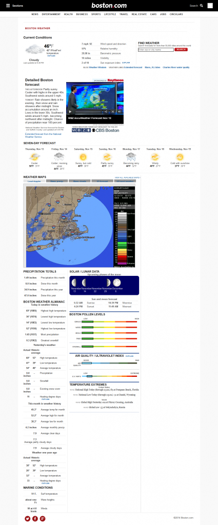
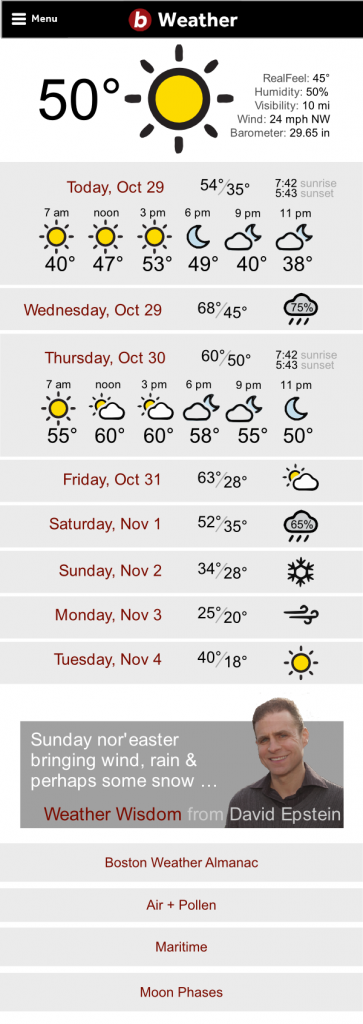
Boston.com’s existing weather section is serviceable but outdated and looks out of place in their current site design. It presents far too much information, such as detailed historical weather data and marine conditions; which requires users to scroll down a lot, which was one of the most common complaints we heard while conducting user research.
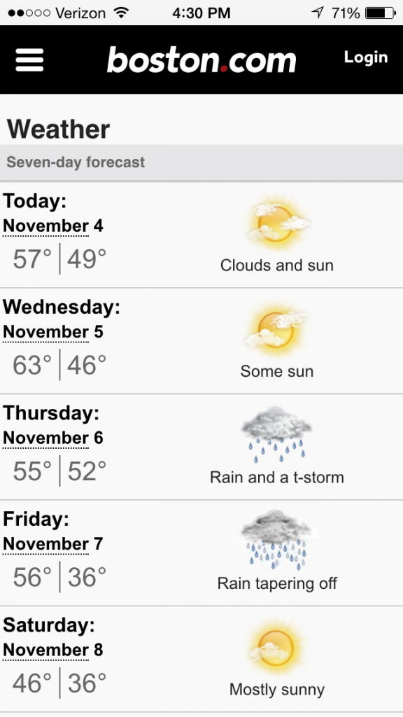
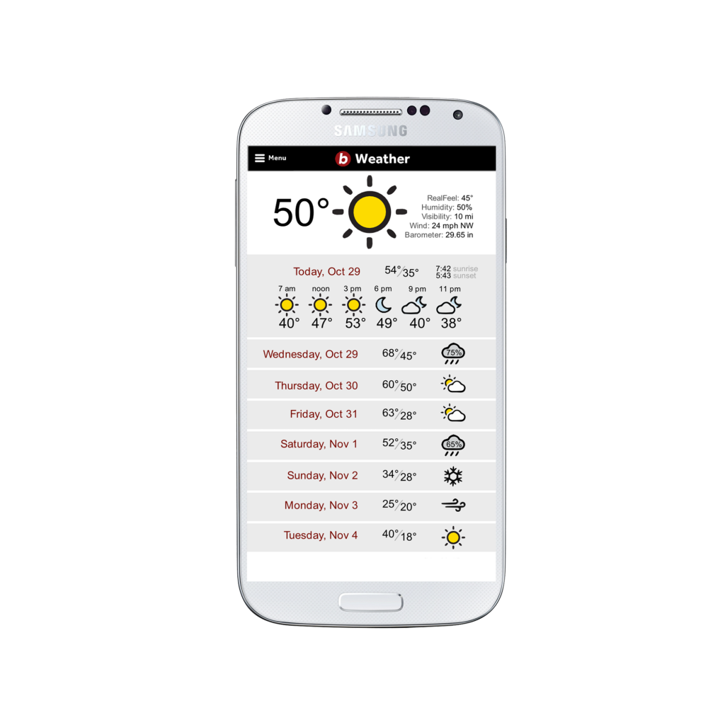
Their existing mobile site is fairly bare bones, with nothing but the weekly forecast.
User research
Research was a major focus of this project. The client was able to provide us with some data on existing users, but it was mostly for a largely older demographic, while Boston.com has since shifted it’s target demographic to a somewhat lower age group.
We put out a survey on social media to learn more about why/how people checked the weather, if/how they used Boston.com, and what their general feelings on life in Boston were. Based on over 100 responses, we found that:
Most of our respondents used Boston.com in some capacity, but only a small percentage used it for weather.
The immediate forecast (daily, weekly, and current conditions) is by far the most important information to people checking the weather.
Probably our most valuable insight from the entire survey was simply determining that most people checking the weather are doing so to plan for events in the immediate future (i.e., some time between the current moment and the end of the week).
We also did several rounds of user interviews to help more clearly define our user’s demographics and weather related habits.
Personas
We created four personas based on distinct user groups we identified:
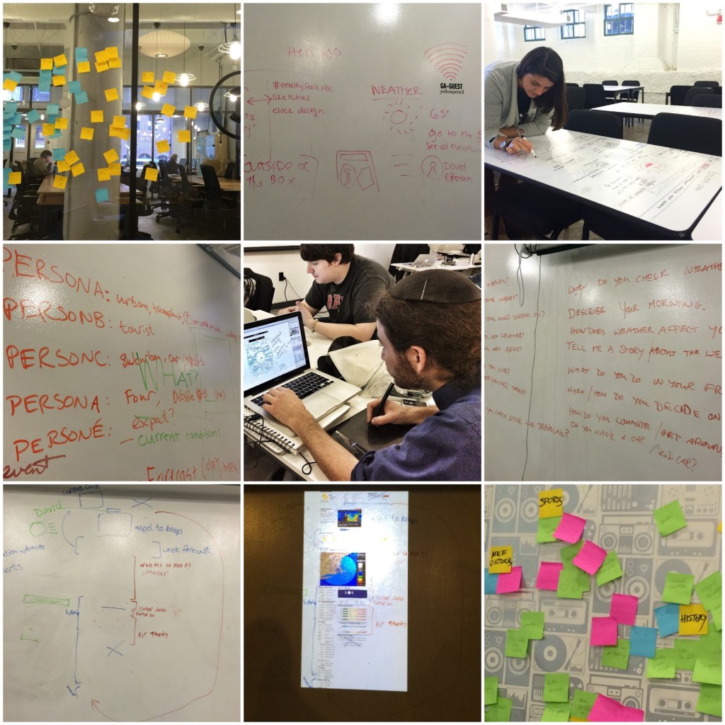
Sketches and Ideation
We did a large amount of sketching and brainstorming in the limited time we had that wasn’t spent on user research, testing, or building wireframes/mockups. A major focus of this project was on information architecture and interaction.
We found in our research that while the current page presents a large amount of information that most users ignore, some people actually do make use of some of the more obscure features, so it became very important to prioritize important information that people wanted access to quickly, while still preserving the less-used features.
We did a fair amount of brainstorming and came up with a number of unique ideas to make the page more relevant to Bostonians (such as aggregating local weather-related tweets and photography) which unfortunately had to be dropped due to resource and technical constraints.
Wireframes
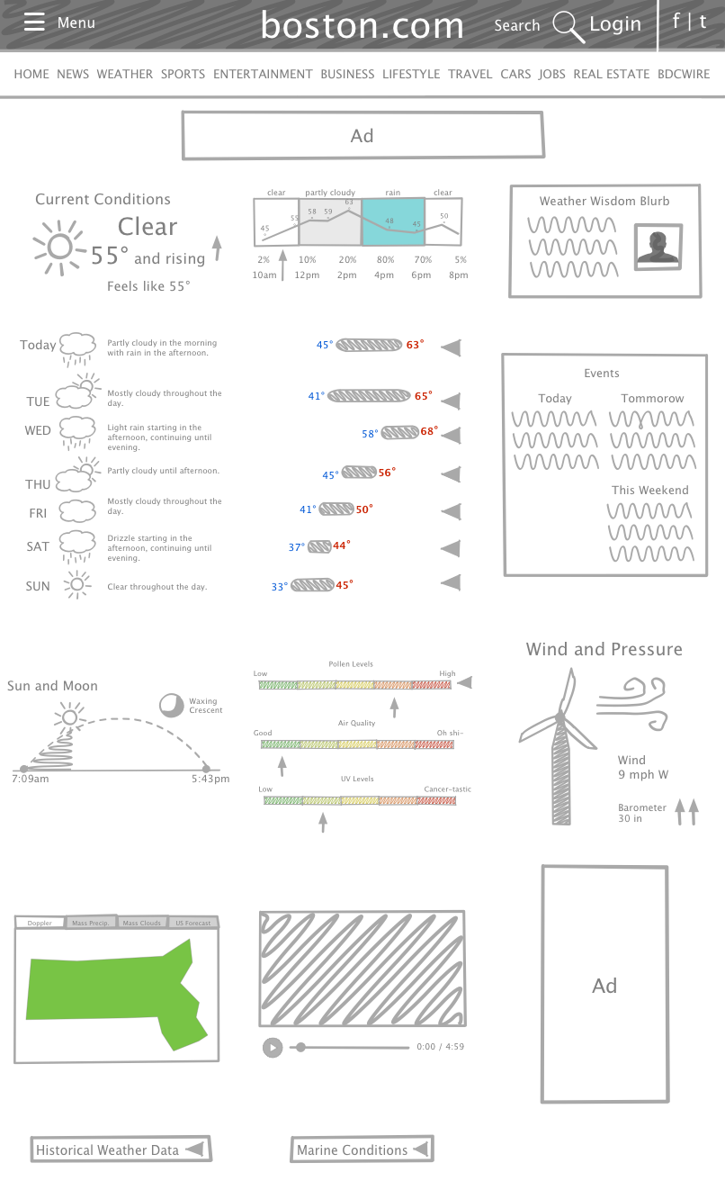
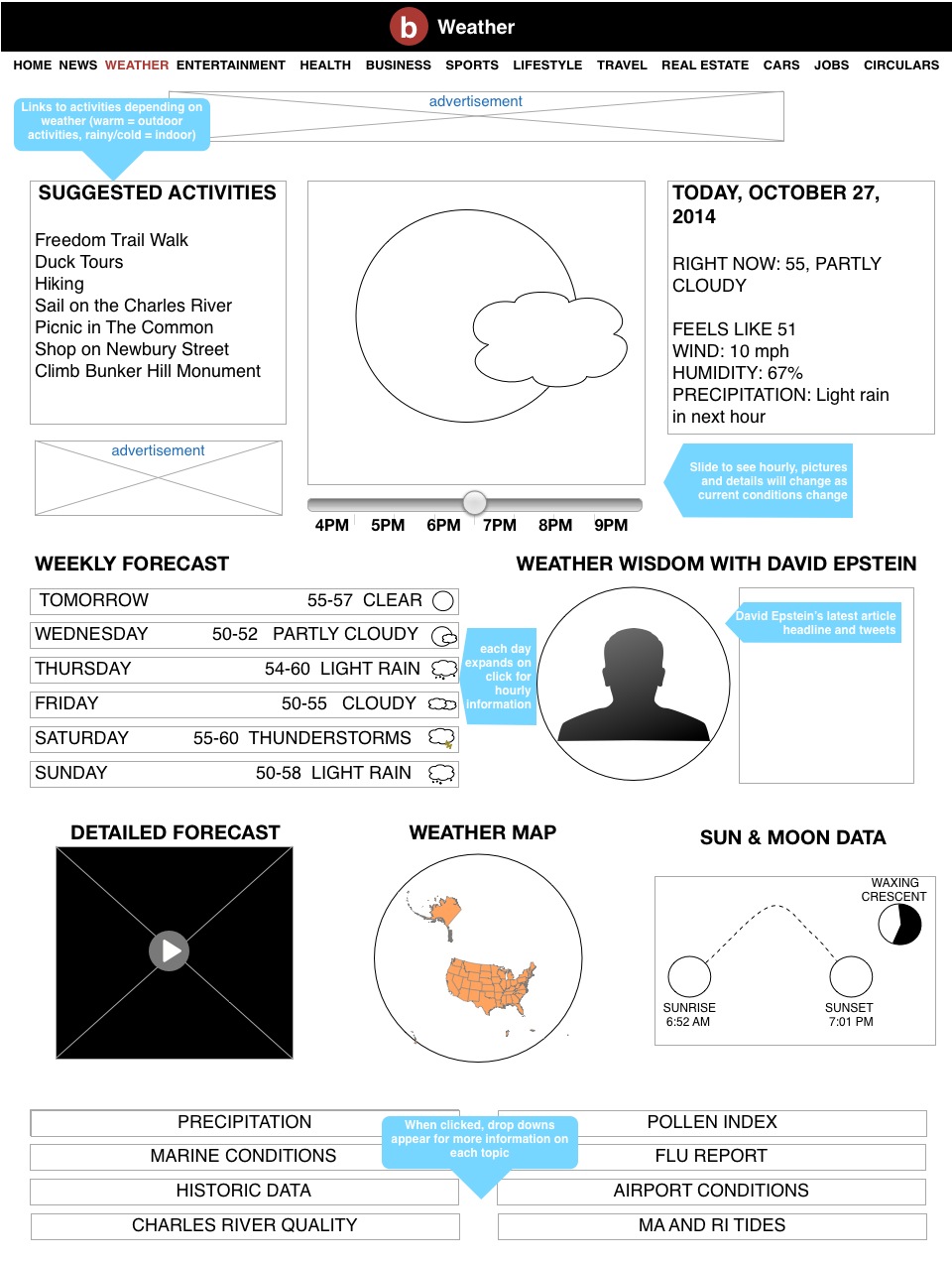
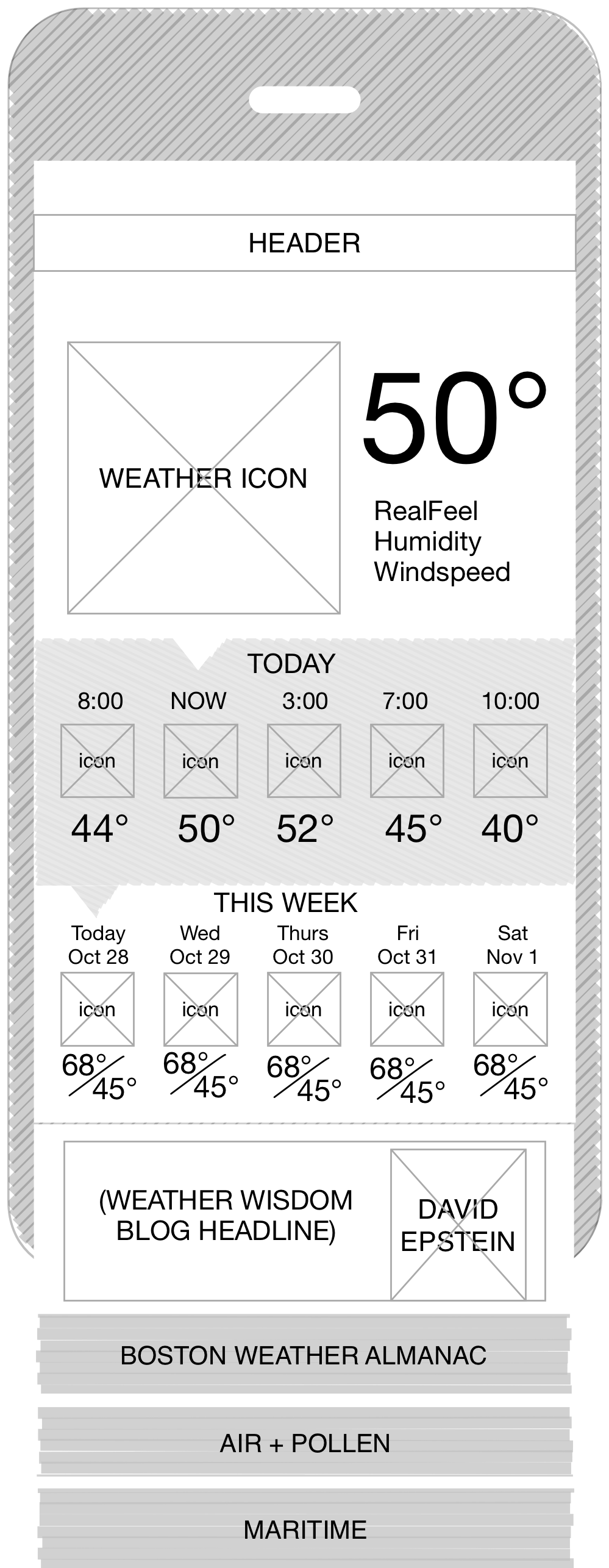
We created a series of wireframes for both mobile and desktop.
After several rounds of meeting with the client and making revisions based on some of their preferences and constraints, we settled on several designs to move on to the testing phase.
Mockups/Clickable prototype
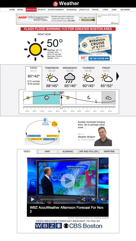
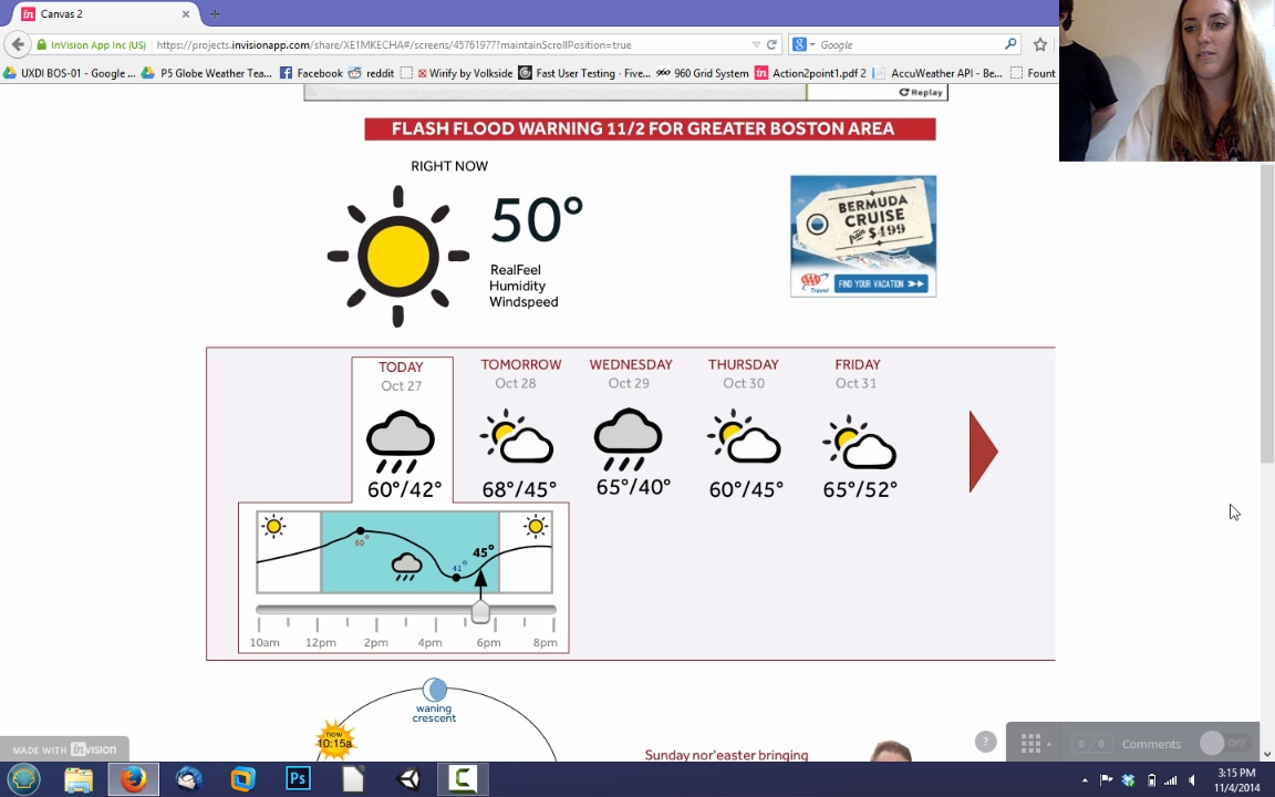
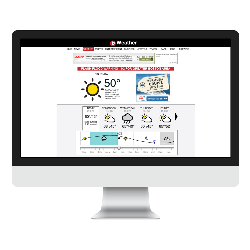
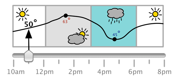
A mockup of desktop site including hourly forecast in interactive “weather slider”, for today and upcoming days.
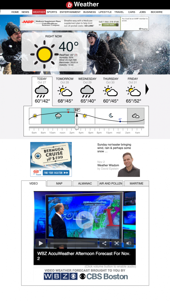
We also considered a version with pictures of local people which changed depending on current conditions. We found in our user research that a large number of people checked the weather specifically to figure out what to wear, and this serves as a good visual indicator while providing a local feel.
A large focus of this project was on making weather information easily accessible and one of the results was this weather slider. It displays the current temperature and conditions, as well as the daily high and low, and allows users to simply swipe to check the temperature for any time of day.
(This prototype is interactive)
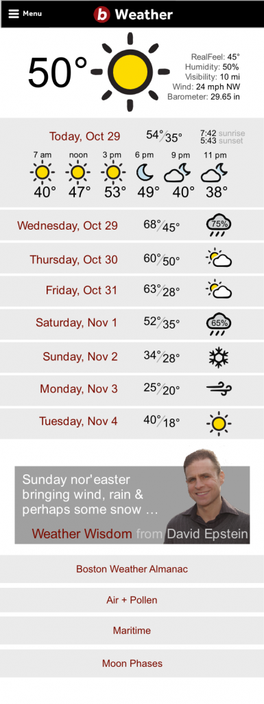
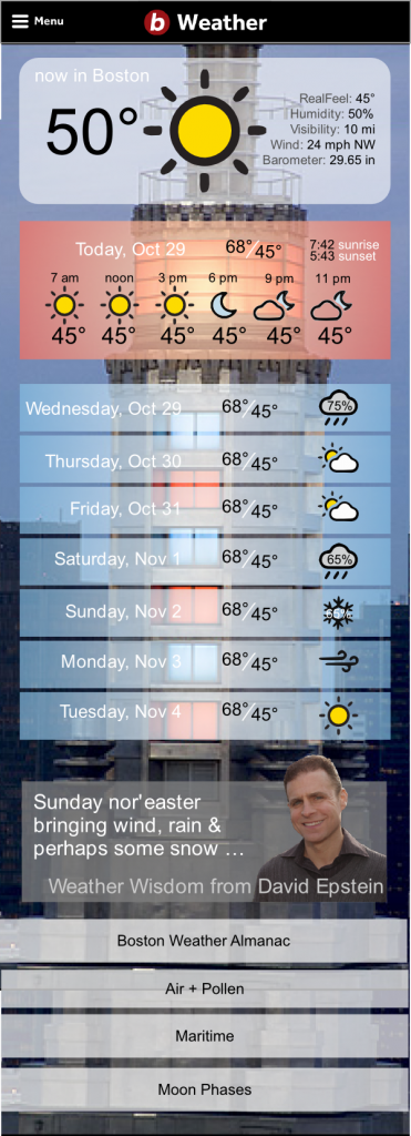
We also ended up with several different concepts for a mobile version. The first is somewhat plain, but functional and easy to grasp, while the second takes a similar visual approach to the desktop version to give it more of a local feeling.
Testing and iteration
We did several rounds of formal user testing for both the desktop and mobile versions.
These tests gave us some valuable insight about which of our desktop designs to finalize and which one to drop, as it turned out people were having serious issues figuring out how to read the forecast with our first design.
We also did an online test with UsabilityHub to validate that most people could easily grasp how to read and use the weather slider by just looking at it for a few seconds, which most could.
Proposed Solution
A streamlined page that places much more emphasis on checking the immediate forecast, as well as showcasing information specifically relevant to Bostonians, such as David Epstein’s blog (a very popular local meteorologist).


