“Oh god, why.”
“WebMD wants to increase their user acquisition and retention by creating a health profile tool that collects users’ health information and provides personalized suggestions.”
Team
Chelsea Evans, Harry Krug, Hitomi Abiko
Time Constraint
2 weeks
Problem
How can we acquire and retain users for WebMD without scaring them off or violating HIPAA regulations by trying to collect too much information?
Proposed Solution
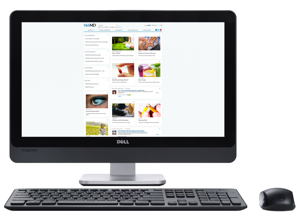
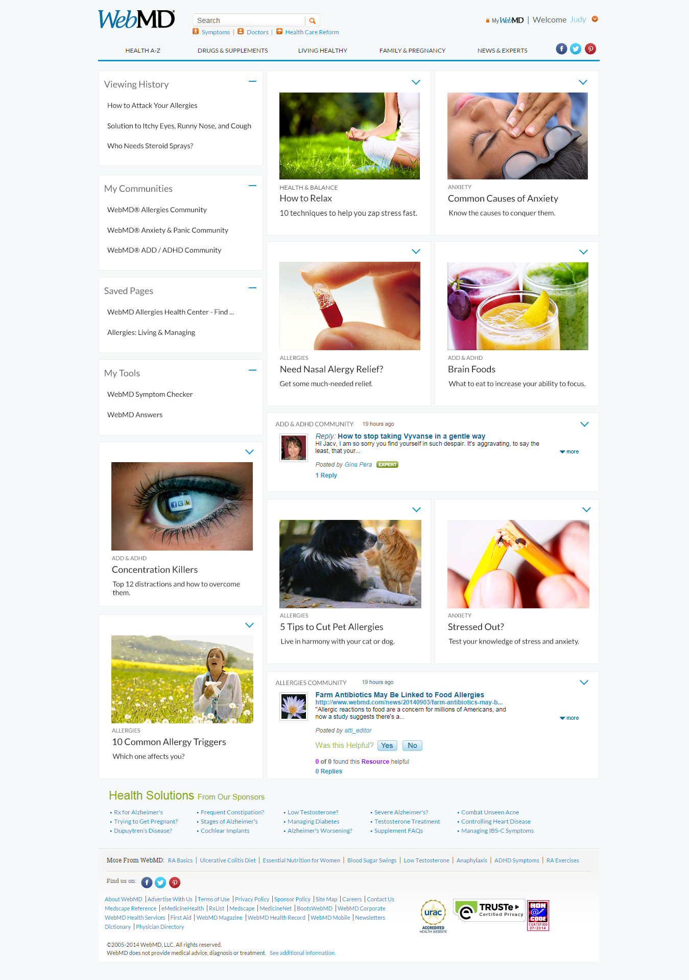
A personalized home page with an improved navigation scheme, populated with articles and community messages based on previously viewed pages, saved pages, communities, and other data.
View PrototypeExisting product
Anyone who’s ever used WebMD for anything other than checking to see if their chest cold is actually cancer will probably tell you it’s fairly hard to find anything, and that seems to be an overarching theme across the entire site; the site has a huge number of number of features which are almost entirely segmented off from each other and are very hard to find.
User research
In trying to figure out who our target audience was, we started off by analyzing what appeared to be WebMD’s current target audience. The main use for most people seems to be looking up symptoms when they are sick or getting sick, but according to Alexa, the average user was only on WebMD for less than two and a half minutes per visit, not exactly a captive audience. Their current homepage is a health blog with a focus on click generating (clickbaity?) articles about popular topics like diet, fitness, and general health, which seemed to be mostly geared towards women, who make up the large majority of their user base.
We put out a brief survey on social media to learn more about people’s use habits regarding WebMD. Based on over 100 responses, we were able to determine that, as suspected, most people only used the site for its Symptom Checker feature and not much else, many were unaware that it even had other content.
Personas
We created three personas based on distinct user groups we identified:
Anna Cabana: Health conscious hipster
- She generally browses the internet for health information and links to WebMD from other sources or search engines
- Site use is low to moderate, she also gets information from other sources
Michael: The med student
- Uses WebMD as a source of information to complete his school assignments
- Site use is moderate, he also uses other sources like text books and his professors
Judy: Person with a recurring illness
- She has anxiety, allergies and her son has ADHD
- She already has a WebMD account and uses it to gather information about her family’s health issues
- She wants to stay up to date and informed about the latest treatments and medications, so her use of WebMD is high
Sketches and Testing
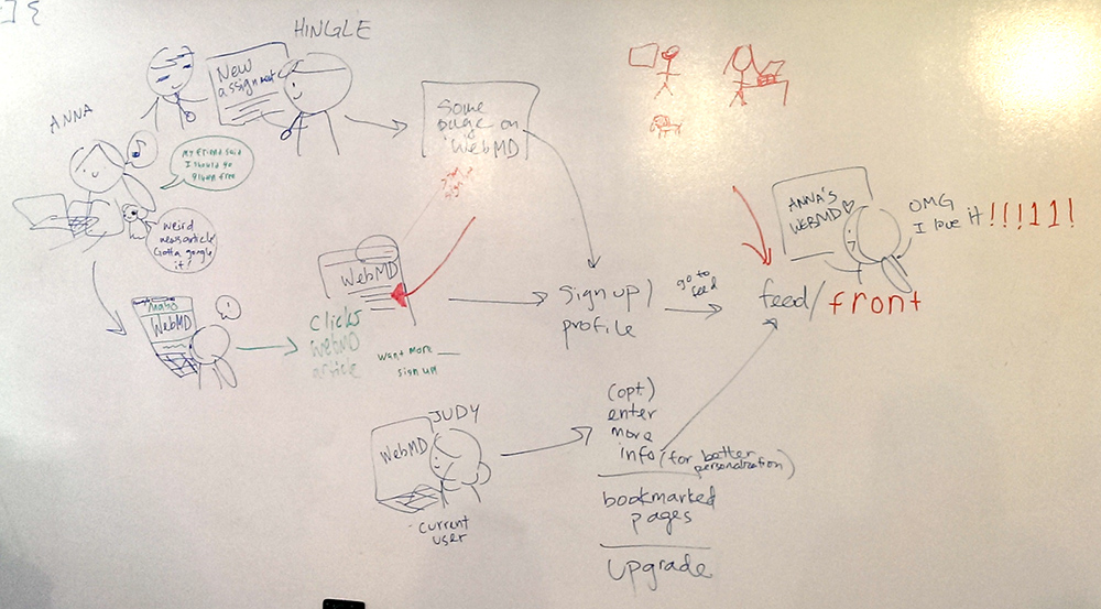
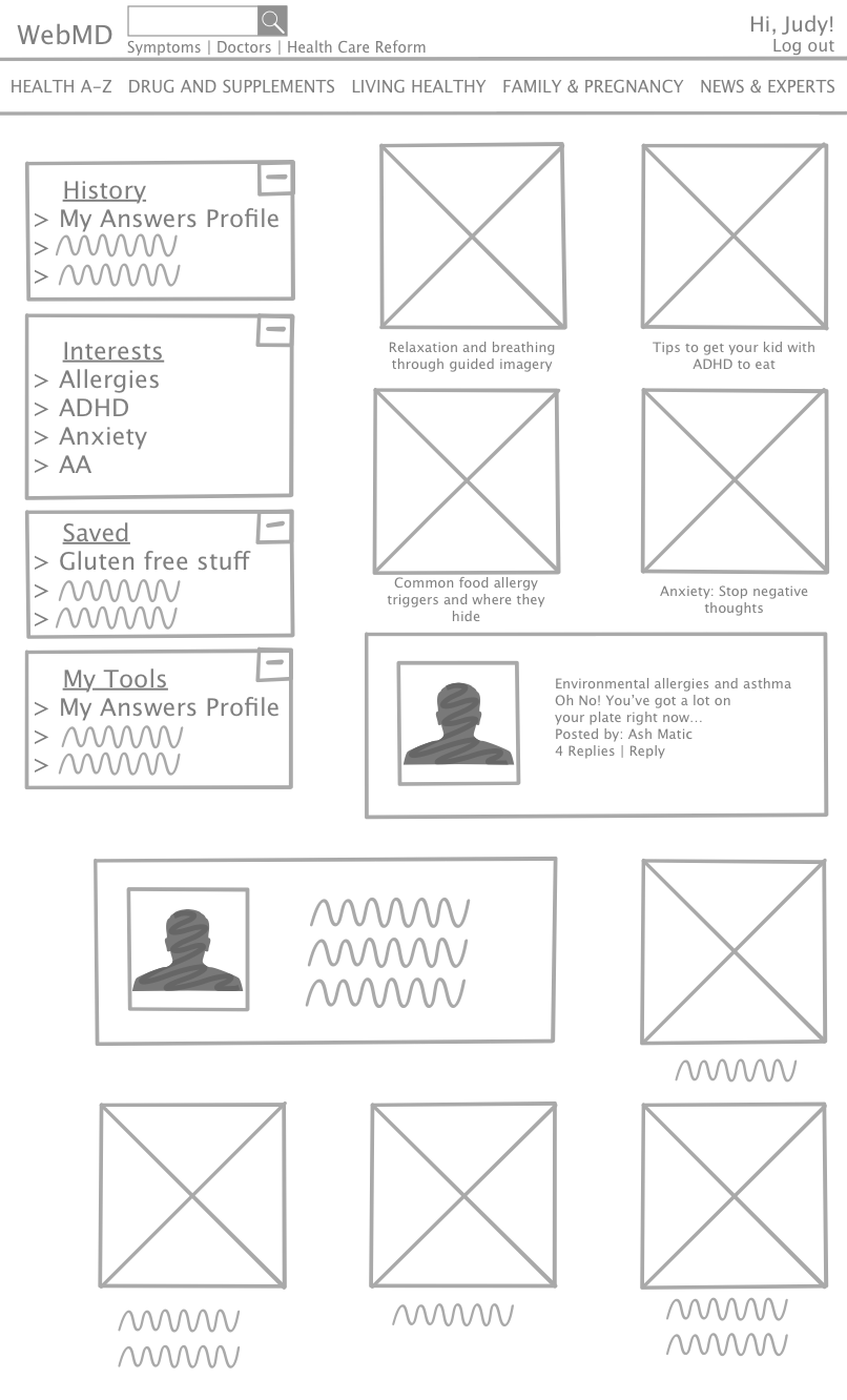
We started with some basic user flows, cute sketches seem to help with user empathy a bit.
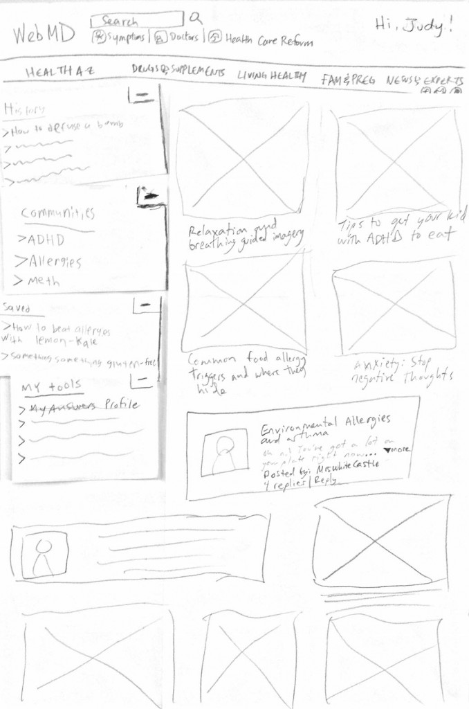
Next was a collaborative, movable paper prototype combining all team member’s sketches.
We did a few user tests and some minor revisions with this prototype before moving on to wireframes, which were quickly followed by mockups.
Wireframes
In this case we just used wireframes as a stepping stone in our design process, as the changes to WebMD’s existing page were relatively simple to do by modifying the existing CSS and using a bit of Photoshop. Normally it might have made sense to spend more time on the wireframes, but given the short timespan for this project, it made more sense to shoot for mockups and a clickable prototype so we could get to testing sooner.
Mockups/Clickable prototype
We moved fairly quickly to hi-def mockups made by modifying WebMD’s existing CSS along with a bit of Photoshop wizardry.
Testing and iteration
We did a combination of in person user testing of the overall site design, and distributed online testing of certain features with UsabilityHub.
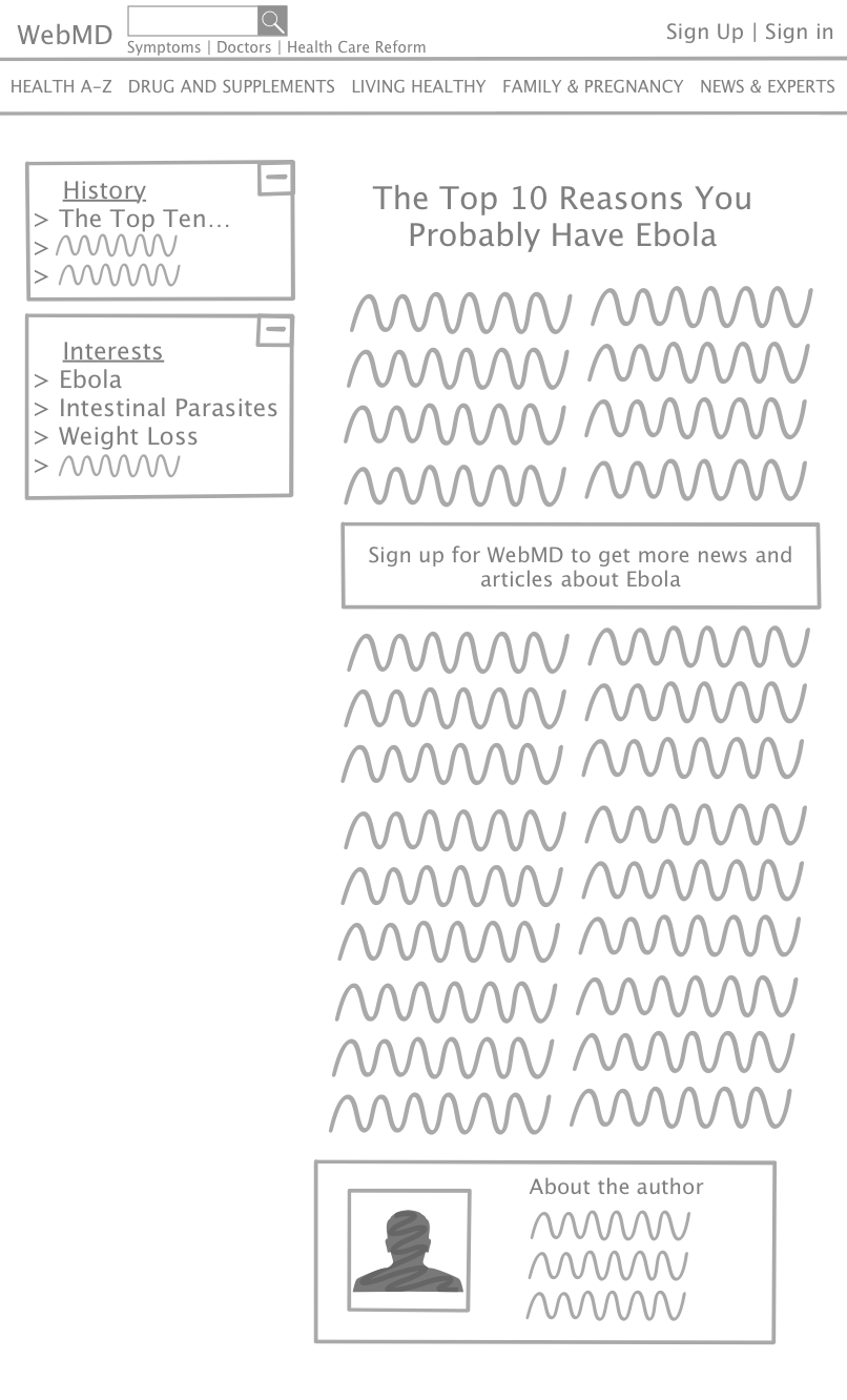
Making new users aware of our profile system and motivating them to actually sign up proved to be a challenge. We tested using in-article messages (similar to those found on some news websites) letting users know that they could subscribe to get more personalized content about topics they’re interested in. Based on our testing, we found that this didn’t grab users’ attention as much as we expected.
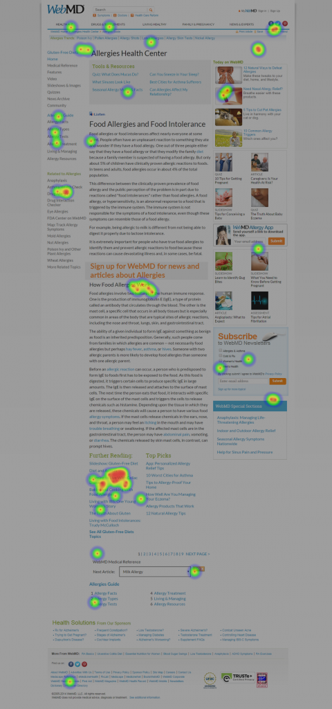
After several iterations we found that using a larger font in a more noticeable color made people much more likely to click it if they were interested in signing up.
Takeaways
- User research and interviews are crucial. Having well constructed personas helped immensely with predicting user behaviors and focusing are efforts on who we were really designing for.
- Highly collaborative design produces good results. Most of our design work on the project was either done collaboratively using whiteboards/Google Docs, or initially done individually and then combined by taking the best elements from each. I feel like this approach produced a very cohesive workflow and end result.


